Logistic regression is a machine learning algorithm used in supervised learning used for classification problems trying to predict the label of data points.
In logistic regression, the predicted value will be given from the highest probability of getting that value.
Learn Logistic Regression
This post is an overview of the logistic regression algorithm and is in no way complete.
If you want to learn more about logistic regression algorithms, here are a few Datacamp tutorials that helped me.
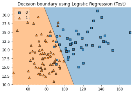
What is the Logistic Regression Algorithm?
Logistic regression is one of the several regression models used in machine learning.
This visualization helps understand how logistic regression works.
The line represents the linear decision boundary.
Given a new value:
- If the probability to find a value is below 0.5, it will be given the value 0 (blue).
- If the probability is above 0.5, it will be given the value 1 (orange).
Logistic Regression Formula
The Logistic Regression is based on the Sigmoid mathematical function that has a S shape.
The Sigmoid function (also called logistic function).

Linear Regression VS Logistic Regression
- The Linear regression is estimated using the Ordinary Least Squares (OLS) approach.
- The logistic regression is estimated using the Maximum Likelihood Estimation (MLE) approach.
While linear regression is a fantastic technique when the data follows a normal distribution, it is less useful when it doesn’t.
Let’s have an example where the data is not following a normal distribution.
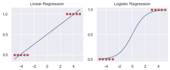
Here we can see that the logistic regression better fits the data.
3 types of logistic regression
Binary Logistic Regression
When the response variable can only belong to two categories.
Example: predict the number of sales of a product. Sold or not Sold.
Multinomial Logistic Regression
When the response variable can belong to multiple nominal categories (3 or more).
Example: predict out of 3 varieties of flowers based on sepal features in the Iris dataset.
Ordinal Logistic Regression
When the response variable can belong to multiple ordinal categories (3 or more).
Example: predict the rating of a business based on social media rating from 1 to 5.
Make Logistic Regression with Scikit-learn on Binary Classification Models
To better understand logistic regressions, we will make Logistic Regression on a binary classification model using Python and Scikit-learn.
In this tutorial, I will look at the online shopper’s behaviour and try to predict whether or not a product will be sold.
Load Libraries
Here, we will use matplotlib, numpy, pandas, seaborn, scipy and sklearn.
# Load standard libraries
import matplotlib.pyplot as plt
import numpy as np
import pandas as pd
import seaborn as sns

# Load Scipy EDA libraries
from scipy.cluster.hierarchy import linkage, dendrogram, fcluster
from scipy.spatial.distance import squareform

# Load sklearn libraries
from sklearn.impute import SimpleImputer
from sklearn.linear_model import LogisticRegression
from sklearn.metrics import classification_report, plot_confusion_matrix, roc_curve
from sklearn.model_selection import GridSearchCV, train_test_split
from sklearn.preprocessing import StandardScaler

# Set graph style to default Seaborn style
sns.set()
Load dataset
Let’s read the online_shoppers_intention from a URL on the Machine Learning Repository.
db = 'https://archive.ics.uci.edu/ml/machine-learning-databases'
url = db + '/00468/online_shoppers_intention.csv'
df = pd.read_csv(url)
Exploratory data analysis (EDA)
Inspect dataframe
df.head(3)

Check dataframe info
df.info()
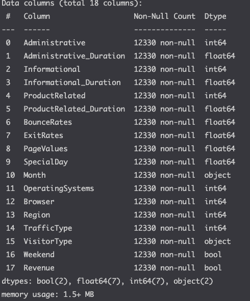
Here we see that there a no missing values and see the different data types for each column.
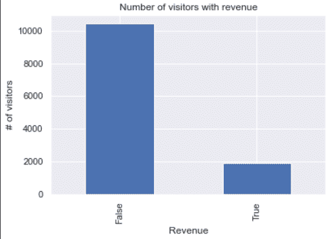
Visualize the target
First, let’s look at the variable that we will try to predict.
df.Revenue.value_counts().plot(kind='bar')
plt.xlabel('Revenue')
plt.ylabel('# of visitors')
plt.title('Number of visitors with revenue')
plt.show()
Visualize some of the features
Now, let’s try to understand the features of our dataset by plotting them.
cols = ['VisitorType', 'Month', 'Weekend']
num_col = len(cols)
fig, axes = plt.subplots(1, num_col, figsize=(12, 3))
for i in range(len(cols)):
    sns.barplot(ax=axes[i],
        x=cols[i],
        y='Revenue',
        data=df
    )
    axes[i].set_title(f'Revenue - {cols[i]}')
fig.tight_layout()
plt.show()
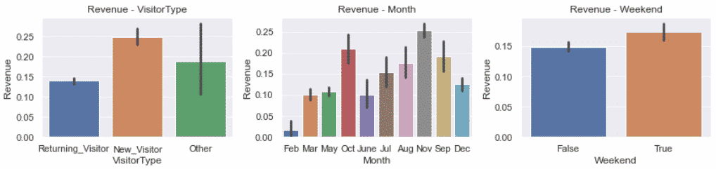
Here, we see that although there was no missing value, the Other column of the VisitorType seems like a missing value.
The other category makes no sense, either you are a new visitor or a returning visitor. We will have to handle that later.
Otherwise, we can see that we can expect more sales in November and in the Weekend.
We can also plot the impact of bounce rate on revenues.
sns.violinplot(x='Revenue', y='BounceRates', data=df)
plt.title('Impact of bounce rate on revenues')
plt.show()
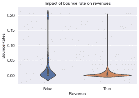
Here we see that the bounce rate need to be close to 0 in order to lead to a sale. Make sense, how can you purchase a product without clicking anywhere?
Understand the correlation between variables
columns = df.select_dtypes(include=['int64', 'float64', 'int32']).columns
subset = df[columns]
corr = subset.corr()

sns.heatmap(round(corr,2), cmap='RdBu', annot=True,
            annot_kws={'size': 7}, vmin=-1, vmax=1)

plt.title('Correlation matrix of numeric features')
plt.show()
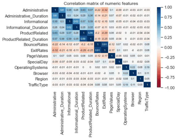
We can see that the most correlated features are between the BounceRates and the ExitRates.
Initiate Independent and Dependent variables
Classification algorithms will try to classify targets (dependent variables) using the features (independent variables) as predictors.
- target =
Revenue - features = Every column except
Revenue
X = df.drop('Revenue', axis=1)
y = df['Revenue']
Data Preprocessing
Data preprocessing will be useful to improve the accuracy of the LogisticRegression predictions.
Remove irrelevant features
The PageValues feature is irrelevant to predicting the number of sales.
I should say, it is too good a predictor in the way that it is caused by the number of sales.
As the number of sales increases the page value increases. Not the other way around. To have a relevant model we shouldn’t use this feature as a predictor.
X.drop('PageValues', axis=1, inplace=True)
Impute missing values
Now, let’s take care of the visitor types classified as other.
As we have seen earlier, these should be considered missing since you are either a new or a returning visitor.
import numpy as np
from sklearn.impute import SimpleImputer

# replace other by np.nan values
X['VisitorType'].replace('Other', np.nan, inplace=True)

# replace nan values with the most frequent value.
imp = SimpleImputer(missing_values=np.nan, strategy='most_frequent')
X['VisitorType'] = imp.fit_transform(X[['VisitorType']])
Handle categorical data
Scikit-learn requires the categorical features to be converted to continuous numeric features.
We’ll first convert the True and False to 1s and 0s.
# convert bool to int
X['Weekend'] = X['Weekend'].astype(int)
Then convert all other categorical features to numeric using pandas get_dummies.
import pandas as pd
X = pd.get_dummies(X, drop_first=True)
X.head(3)
Scale numeric data
To improve the accuracy of the model, preprocess the numeric features so that they all are on the same scale.
from sklearn.preprocessing import StandardScaler

num_cols = [
    'Administrative_Duration',
    'Informational_Duration',
    'ProductRelated_Duration',
    'BounceRates',
    'ExitRates',
    'SpecialDay'
    ]

scaler = StandardScaler()
X[num_cols] = scaler.fit_transform(X[num_cols])
Split into Training and Testing sets
To be able to evaluate the quality of the model, we need to split the data into training and testing sets.
The model will be trained on the training set.
Then the prediction will be made on that trained model.
Then the prediction will be compared to real-world data to evaluate how accurate the model is.
from sklearn.model_selection import train_test_split

X_train, X_test, y_train, y_test = train_test_split(X, y, test_size=0.3, random_state=42)
Apply the Logistic Regression
The LogisticRegression can take multiple parameters.
GridSearchCV is used to identify and use the best possible parameter for the LogisticRegression.
The .fit() method is used to train the model.
%%time
from sklearn.linear_model import LogisticRegression
from sklearn.model_selection import GridSearchCV
# define log_reg parameters to try
params = {
'C': [0.001, 0.01, 0.1, 1.],
'penalty': ['l1', 'l2']
}
# initiate the logistic regression
log_reg = LogisticRegression(
random_state=42,
class_weight='balanced',
solver='liblinear'
)
# find and use the best parameters
# of the logistic regression
log_reg_cv = GridSearchCV(
log_reg,
param_grid=params,
cv=5,
scoring='accuracy',
)
# train the model on the training set
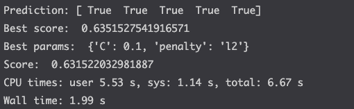
log_reg_cv.fit(X_train, y_train)
# make prediction
y_pred = log_reg_cv.predict(X_test)
print(f'Prediction: {y_pred[:5]}')
# compute the score and the print parameters used
print('Best score: ', log_reg_cv.best_score_)
print('Best params: ', log_reg_cv.best_params_)
print('Score: ', log_reg_cv.score(X_test, y_test))
Fine-tune the model
Above, we saw that the accuracy of the model was around 63%. Which is not a great score depending on what you intend to do with the data.
You can improve that score by fine-tuning the model.
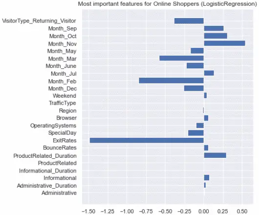
Evaluate the feature importance
Let’s look at which features influenced the most model.
# estimate feature importance
feature_imp = log_reg_cv.best_estimator_.coef_[0]

# Set fig size
f = plt.figure()
f.set_figheight(7)

# set label names
labels = list(X_train.columns)

# plot graph
plt.barh([x for x in range(len(feature_imp))], feature_imp)
plt.yticks(range(len(labels)), labels)
plt.title('Most important features for Online Shoppers (LogisticRegression)')

plt.show()
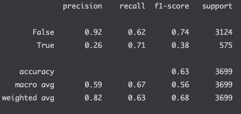
Compute the Classification Report
Evaluate the precision of your model with the classification report.
from sklearn.metrics import classification_report

# make prediction
y_pred = log_reg_cv.predict(X_test)

# compute the classification report
print(classification_report(y_test, y_pred))
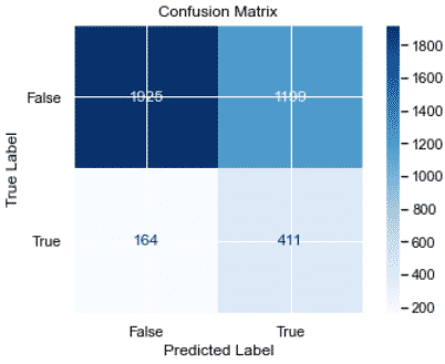
Plot the confusion matrix
Plot the recall of the model in a confusion matrix.
from sklearn.metrics import plot_confusion_matrix

color = 'black'
matrix = plot_confusion_matrix(log_reg_cv, X_test, y_test, cmap=plt.cm.Blues)
matrix.ax_.set_title('Confusion Matrix', color=color)
plt.xlabel('Predicted Label', color=color)
plt.ylabel('True Label', color=color)
plt.gcf().axes[0].tick_params(colors=color)
plt.gcf().axes[1].tick_params(colors=color)
plt.show()
Plot the ROC Curve
Plot the receiver operating characteristic curve (ROC curve) to check the impact of varying the threshold on the true positive rates and false-positive rates.
from sklearn.metrics import roc_curve

y_pred_prob = log_reg_cv.predict_proba(X_test)[:,1]
fpr, tpr, thresholds = roc_curve(y_test, y_pred_prob)

plt.plot([0,1],[1,0],'k--')
plt.plot(fpr, tpr, label='Logistic Regression')
plt.xlabel('False Positive Rate')
plt.ylabel('True Positive Rate')
plt.title('Logistic Regression ROC curve')
plt.show()
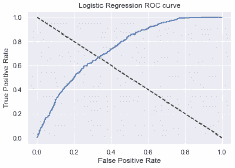
The larger the area under the curve, the better the model.
from sklearn.metrics import roc_auc_score
y_pred_prob = log_reg_cv.predict_proba(X_test)[:,1]
roc_auc_score(y_test, y_pred_prob)
# 0.7392785169515115
Conclusion
Huge. Huge congratulations for completing this course on Logistic Regressions with Scikit-learn!

SEO Strategist at Tripadvisor, ex- Seek (Melbourne, Australia). Specialized in technical SEO. Writer in Python, Information Retrieval, SEO and machine learning. Guest author at SearchEngineJournal, SearchEngineLand and OnCrawl.