Seaborn is a data visualization library in Python that is built on top of the Matplotlib package. It brings intuitive functions to help solve most problems encountered by other libraries.
Data scientists or SEOs will reap great rewards from mastering Seaborn visualizations.
Matplotlib is great but has its flaws. Indeed, a good example of those flaws is that Matplotlib’s functions don’t interact very well with Pandas’ Dataframes.
Seaborn bridges that gap.
Learn Seaborn
In this post, we will cover the basics of Seaborn. But since it is such a fantastic data visualization library for data science, you may want to go deeper by following these tutorials on Datacamp.
Install Seaborn
$ pip install seaborn
Import Seaborn Package
import seaborn as sns
import matplotlib.pyplot as plt
sns.set()
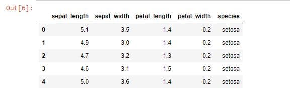
Load a dataset with Seaborn
Seaborn has a variety of built-in datasets that you can load like this:
import seaborn as sns

df = sns.load_dataset('iris')
df.head()
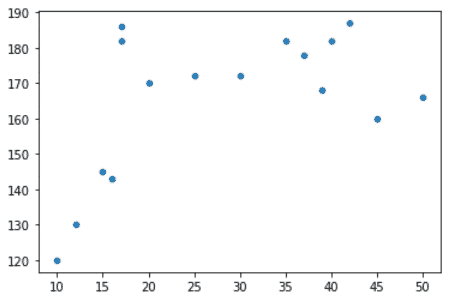
Create a scatter plot
Scatter plots are useful to show relationships between numeric variables.
import seaborn as sns
import matplotlib.pyplot as plt

age = [10,12,15,16,17,17,20,25,30,35,37,39,40,42,45,50]
height = [120,130,145,143,182,186,170,172,172,182,178,168,182,187,160,166]

sns.scatterplot(x=age, y=height)
plt.xlabel('age')
plt.ylabel('height')
plt.title('Height vs age')
plt.show()
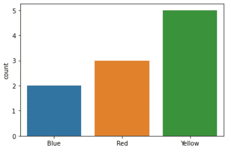
Create a Count plot
Count plots are useful to show relationships between categorical variables.
import seaborn as sns
import matplotlib.pyplot as plt

colors = ['Blue','Blue','Red','Red','Red','Yellow','Yellow','Yellow','Yellow','Yellow']

sns.countplot(x=colors)
plt.show()
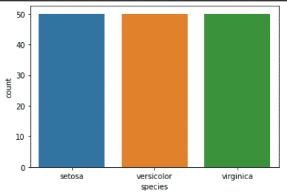
Use Seaborn with Pandas
You can use seaborn with Pandas dataframes quite easily using the data keyword.
import matplotlib.pytplot as plt
import pandas as pd
import seaborn as sns

df = pd.read_csv('iris.csv')
sns.countplot(x='species', data=df)
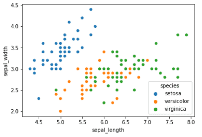
Add a Third Variable with Hue
You can add more than two variables to a seaborn visualization by using the hue keyword.
import seaborn as sns

data = sns.load_dataset('iris')
sns.scatterplot(x='sepal_length',
                y='sepal_width',
                data=data,
                hue='species')
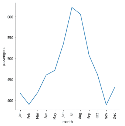
Create a lineplot with Seaborn
Often, you will need to work with dates. One of the most useful data visualizations for dates is the line plot.
import matplotlib.pyplot as plt
import pandas as pd
import seaborn as sns

df = sns.load_dataset('flights')

f_1960 = df[df['year'] == 1960]
sns.relplot(x='month',y='passengers',
            data=f_1960,
            kind='line')

plt.xticks(rotation=90)
plt.show()
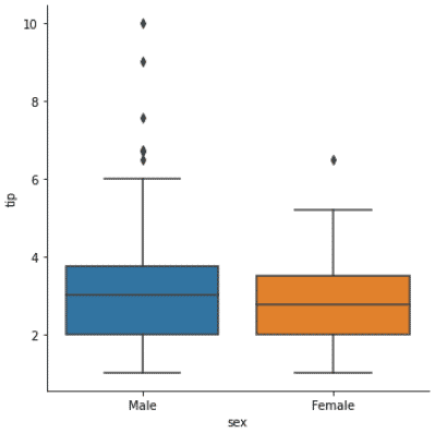
Boxplots
Boxplots are useful to show the distribution of quantitative data across categorical variables.
Understand the boxplot.
- box: 25th to 75th percentile
- middle line: median
- whiskers: spread of distribution.
- points: outliers
import matplotlib.pyplot as plt
import seaborn as sns

tips = sns.load_dataset('tips')

g = sns.catplot(x='sex', y='tip',
                data=tips,
                kind='box')

plt.show()
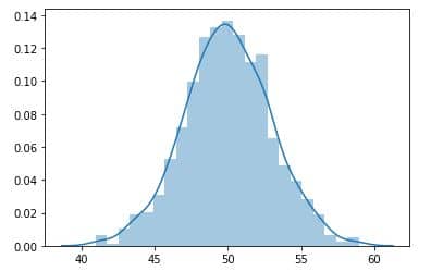
Displot
Let’s recreate our normal distribution graph, this time using Seaborn distplot.
import numpy as np
normal_matrix =np.random.rand(100,1000)
matrix_sum = np.sum(normal_matrix,0)
sns.distplot(matrix_sum, kde=True)
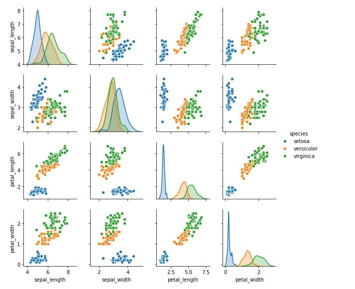
distplotCreate a Pairplot in Seaborn
Pairplots are a fantastic way to visualize your multiple subplots at once to analyse all your variables.
import seaborn as sns

df = sns.load_dataset('iris')
sns.pairplot(df, hue="species", height=2)
Make a Linear Regression in Seaborn
Every plot in Seaborn has a set of fixed parameters. For sns.jointplot, there are three mandatory parameters: the x-axis data, the y-axis data, and the dataset.
To make a linear regression, we need to add to those three parameters, the optional parameter kind="reg" (for Linear Regression).
tips = sns.load_dataset("tips")
sns.jointplot("total_bill","tip",data=tips, kind='reg')
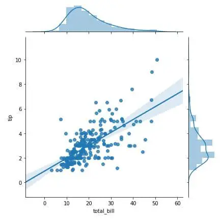
Note that you could also make a linear regression using lmplot() or regplot(). Just follow this awesome guide on linear regression with Seaborn.
What is Next?
Here are other articles that will help improve your Python skills:
Conclusion
If you want to become a data scientist, you should not sleep on Seaborn, but embrace it. Become a power user.
The way I learned Seaborn was by following these two tutorials and I never regretted it.
Or if you are more of a reader, you can simply read the official documentation.
Good luck learning Seaborn.

SEO Strategist at Tripadvisor, ex- Seek (Melbourne, Australia). Specialized in technical SEO. Writer in Python, Information Retrieval, SEO and machine learning. Guest author at SearchEngineJournal, SearchEngineLand and OnCrawl.