As part of the series of tutorials on PCA with Python and Scikit-learn, we will learn various data visualization techniques that can be used with Principal Component Analysis.
In this section, we will learn the 6 best data visualizations techniques and plots that you can use to gain insights from our PCA data. The 6 best plots to use with PCA in Python are:
- Feature Explained Variance Bar Plot
- PCA Scree plot
- 2D PCA Scatter plot
- 3D PCA Scatter plot
- 2D PCA Biplot
- 3D PCA Biplot
We will perform dimension reduction with PCA on the Iris Dataset.
Navigation
Show
Principal Component Analysis Visualization with Python
Data Visualization using PCA in Python helps to make sense of complicated data. By using Principal Component Analysis in Scikit-learn, we can take all the information we have and simplify it into its most important components.
Loading the Iris Dataset in Python
To start, we load the Iris dataset in Python, do some preprocessing and use PCA to reduce the dataset to 3 features. To learn what this means, follow our tutorial on PCA with Python.
import pandas as pd
from sklearn import datasets
from sklearn.preprocessing import StandardScaler
from sklearn.decomposition import PCA

# load features and targets separately
iris = datasets.load_iris()
X = iris.data
y = iris.target

# Data Scaling
x_scaled = StandardScaler().fit_transform(X)

# Reduce from 4 to 3 features with PCA
pca = PCA(n_components=3)

# Fit and transform data
pca_features = pca.fit_transform(x_scaled)
From this data, we will learn various ways to plot PCA with Python.
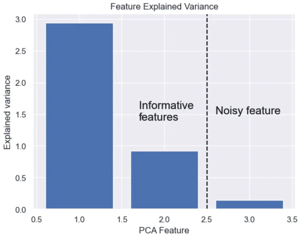
How to Plot the Explained Variance in Python
The explained variance in PCA helps us understand how much information is retained after dimensionality reduction. It is the portion of the original data’s variability that is captured by each principal component.
We can plot the explained variance to see the variance of each principal component feature.
import matplotlib.pyplot as plt
import seaborn as sns
sns.set()

# Bar plot of explained_variance
plt.bar(
    range(1,len(pca.explained_variance_)+1),
    pca.explained_variance_
    )


plt.xlabel('PCA Feature')
plt.ylabel('Explained variance')
plt.title('Feature Explained Variance')
plt.show()
The output graph shows that we do not need 3 features, but only 2. The 3 feature’s variance is obviously not very significant.
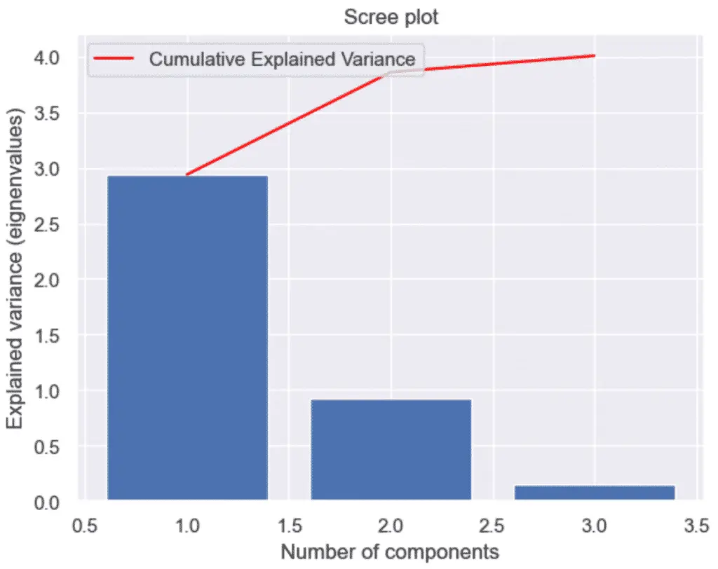
How to Make a Scree Plot with Python and PCA
To make a scree plot, or cumulative explained variance plot, with Python and PCA, first plot an explained variance bar plot and add a secondary plot of the cumulative sum, also know as the Cumulative Explained Variance.
A scree plot is nothing more than a plot of the eigenvalues (also known as the explained variance). Essentially, it provides the same information as the plot above.
import numpy as np
import matplotlib.pyplot as plt
import seaborn as sns
sns.set()

# Scree Plot
import numpy as np
# Bar plot of explained_variance
plt.bar(
    range(1,len(pca.explained_variance_)+1),
    pca.explained_variance_
    )

plt.plot(
    range(1,len(pca.explained_variance_ )+1),
    np.cumsum(pca.explained_variance_),
    c='red',
    label='Cumulative Explained Variance')

plt.legend(loc='upper left')
plt.xlabel('Number of components')
plt.ylabel('Explained variance (eignenvalues)')
plt.title('Scree plot')

plt.show()
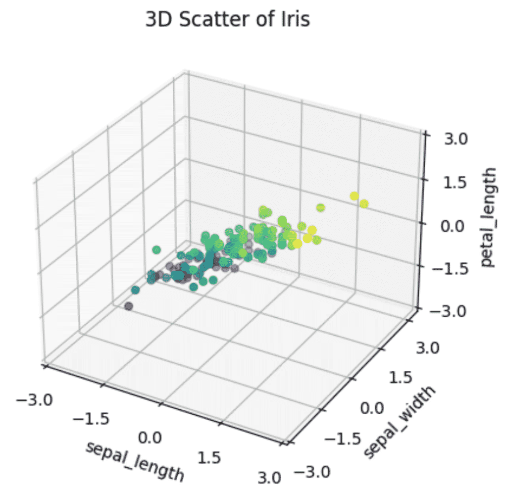
How to Plot a 3D PCA Graph in Python
To plot a 3D PCA Scatter plot in Python, set up a 3D plotting environment in matplotlib using plt.axes(projection='3d') and provide your PCA features to the scatter3D method of the ax object.
ax = plt.axes(projection='3d')
ax.scatter3D(xdata, ydata, zdata, c=zdata, cmap='viridis')
Let’s see an example by plotting our selected features into a 3D graph.
import numpy as np
import matplotlib.pyplot as plt
plt.style.use('default')

# Prepare 3D graph
fig = plt.figure()
ax = plt.axes(projection='3d')

# Plot scaled features
xdata = pca_features[:,0]
ydata = pca_features[:,1]
zdata = pca_features[:,2]

# Plot 3D plot
ax.scatter3D(xdata, ydata, zdata, c=zdata, cmap='viridis')

# Plot title of graph
plt.title(f'3D Scatter of Iris')

# Plot x, y, z even ticks
ticks = np.linspace(-3, 3, num=5)
ax.set_xticks(ticks)
ax.set_yticks(ticks)
ax.set_zticks(ticks)

# Plot x, y, z labels
ax.set_xlabel('sepal_length', rotation=150)
ax.set_ylabel('sepal_width')
ax.set_zlabel('petal_length', rotation=60)
plt.show()
When plotting a 3D graph, it is clearer that there is less variance in Petal length of Iris flowers than in Sepal length or Sepal width, almost making a flat 2D pane inside the 3D graph. That shows that the intrinsic dimension of the data is essentially 2 dimensions instead of 4.
Reducing these 3 features to 2 would not only make the model faster but the visualizations more informative without losing too much information.
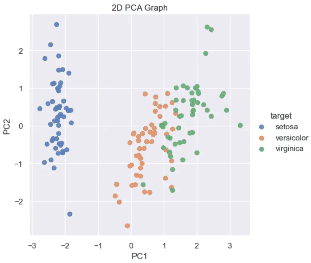
How to Plot a 2D PCA graph in Python
To make a 2D PCA Graph in Python, pass your 2 principal components to the seaborn lmplot function. Make sure that the PCA was instantiated using n_components=2.
sns.lmplot(x='PC1', y='PC2', data=pca_df, ...)Example of a 2D plot in PCA using Python and Scikit-learn:
import pandas as pd
from sklearn.decomposition import PCA

# Reduce from 4 to 2 features with PCA
pca = PCA(n_components=2)

# Fit and transform data
pca_features = pca.fit_transform(x_scaled)

# Create dataframe
pca_df = pd.DataFrame(
    data=pca_features,
    columns=['PC1', 'PC2'])

# map target names to PCA features
target_names = {
    0:'setosa',
    1:'versicolor',
    2:'virginica'
}

pca_df['target'] = y
pca_df['target'] = pca_df['target'].map(target_names)

pca_df.head()
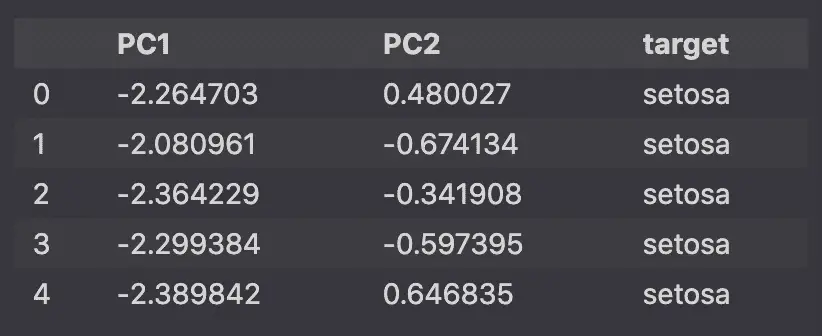
Then, using Seaborn‘s lmplot, we will plot the 2 dimensional principal components on a scatter plot.
import matplotlib.pyplot as plt
import seaborn as sns
sns.set()

sns.lmplot(
    x='PC1',
    y='PC2',
    data=pca_df,
    hue='target',
    fit_reg=False,
    legend=True
    )

plt.title('2D PCA Graph')
plt.show()
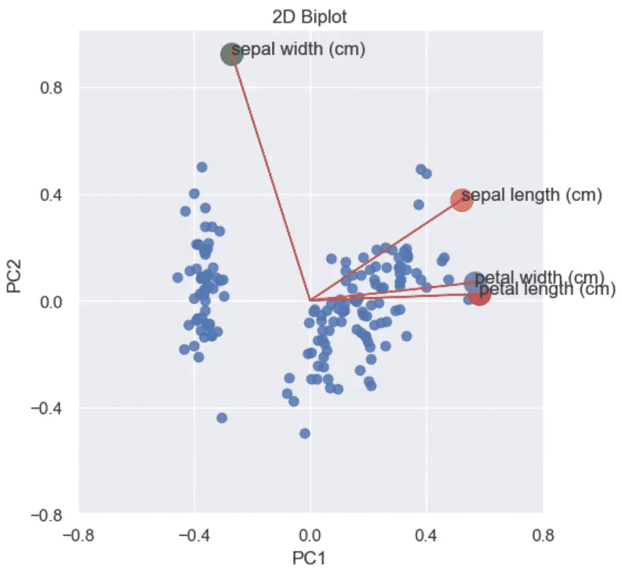
How to Make a PCA 2D Biplots in Python?
A PCA biplot in Python combines the scatter plot of the PCA scores and loading plots to show how data points relate to each other.
A Biplot is a graphs that shows:
- the scaled PCA scatterplots
- the loading plots in addition
- vectors that show how strongly each feature influences the principal component.
To visualize a 2D Biplot, you will first need to create a loading plot and a scatter plot of the PCA data, and then combine them to each other.
Below is an example of how to make a PCA Biplot in Python. To learn more how the Python code works read the related article.
import matplotlib.pyplot as plt
import numpy as np
import seaborn as sns
from sklearn import datasets
from sklearn.preprocessing import StandardScaler
from sklearn.decomposition import PCA
import pandas as pd
sns.set()

# load features and targets separately
iris = datasets.load_iris()
X = iris.data
y = iris.target

# Scale Data
x_scaled = StandardScaler().fit_transform(X)

# Perform PCA on Scaled Data
pca = PCA(n_components=2)

pca_features = pca.fit_transform(x_scaled)

# Principal components correlation coefficients
loadings = pca.components_

# Number of features before PCA
n_features = pca.n_features_in_

# Feature names before PCA
feature_names = iris.feature_names

# PC names
pc_list = [f'PC{i}' for i in list(range(1, n_features + 1))]

# Match PC names to loadings
pc_loadings = dict(zip(pc_list, loadings))

# Matrix of corr coefs between feature names and PCs
loadings_df = pd.DataFrame.from_dict(pc_loadings)
loadings_df['feature_names'] = feature_names
loadings_df = loadings_df.set_index('feature_names')


# Get the loadings of x and y axes
xs = loadings[0]
ys = loadings[1]


# Create DataFrame from PCA
pca_df = pd.DataFrame(
    data=pca_features,
    columns=['PC1', 'PC2'])

# Map Targets to names
target_names = {
    0:'setosa',
    1:'versicolor',
    2:'virginica'
}

pca_df['target'] = y
pca_df['target'] = pca_df['target'].map(target_names)

# Scale PCS into a DataFrame
pca_df_scaled = pca_df.copy()

scaler_df = pca_df[['PC1', 'PC2']]
scaler = 1 / (scaler_df.max() - scaler_df.min())

for index in scaler.index:
    pca_df_scaled[index] *= scaler[index]


# Plot the loadings on a Scatter plot
xs = loadings[0]
ys = loadings[1]

sns.lmplot(
    x='PC1',
    y='PC2',
    data=pca_df_scaled,
    fit_reg=False,
    )

for i, varnames in enumerate(feature_names):
    plt.scatter(xs[i], ys[i], s=200)
    plt.arrow(
        0, 0, # coordinates of arrow base
        xs[i], # length of the arrow along x
        ys[i], # length of the arrow along y
        color='r',
        head_width=0.01
        )
    plt.text(xs[i], ys[i], varnames)

xticks = np.linspace(-0.8, 0.8, num=5)
yticks = np.linspace(-0.8, 0.8, num=5)
plt.xticks(xticks)
plt.yticks(yticks)
plt.xlabel('PC1')
plt.ylabel('PC2')

plt.title('2D Biplot')
plt.show()
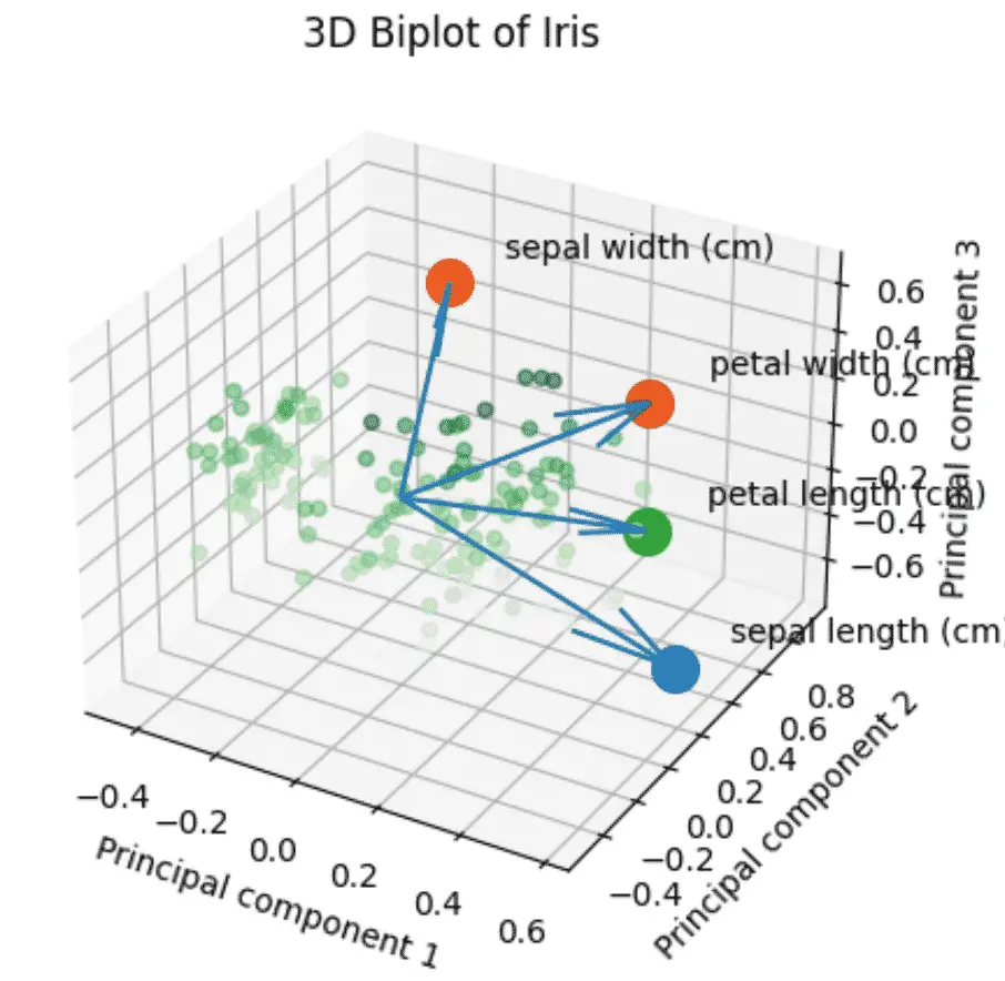
How to make a PCA 3D Biplots in Python?
The 3D biplot combines all the steps above using 3 components instead of 2.
import numpy as np
import pandas as pd
from sklearn import datasets
from sklearn.decomposition import PCA
from sklearn.preprocessing import StandardScaler
plt.style.use('default')

# load features and targets separately
iris = datasets.load_iris()
X = iris.data
y = iris.target

# Scale Data
x_scaled = StandardScaler().fit_transform(X)


pca = PCA(n_components=3)

# Fit and transform data
pca_features = pca.fit_transform(x_scaled)

# Create dataframe
pca_df = pd.DataFrame(
    data=pca_features,
    columns=['PC1', 'PC2', 'PC3'])

# map target names to PCA features
target_names = {
    0:'setosa',
    1:'versicolor',
    2:'virginica'
}

# Apply the targett names
pca_df['target'] = iris.target
pca_df['target'] = pca_df['target'].map(target_names)

# Create the scaled PCA dataframe
pca_df_scaled = pca_df.copy()

scaler_df = pca_df[['PC1', 'PC2', 'PC3']]
scaler = 1 / (scaler_df.max() - scaler_df.min())

for index in scaler.index:
    pca_df_scaled[index] *= scaler[index]

# Initialize the 3D graph
fig = plt.figure()
ax = fig.add_subplot(111, projection='3d')

# Define scaled features as arrays
xdata = pca_df_scaled['PC1']
ydata = pca_df_scaled['PC2']
zdata = pca_df_scaled['PC3']

# Plot 3D scatterplot of PCA
ax.scatter3D(
    xdata,
    ydata,
    zdata,
    c=zdata,
    cmap='Greens',
    alpha=0.5)

# Define the x, y, z variables
loadings = pca.components_
xs = loadings[0]
ys = loadings[1]
zs = loadings[2]

# Plot the loadings
for i, varnames in enumerate(feature_names):
    ax.scatter(xs[i], ys[i], zs[i], s=200)
    ax.text(
        xs[i] + 0.1,
        ys[i] + 0.1,
        zs[i] + 0.1,
        varnames)

# Plot the arrows
x_arr = np.zeros(len(loadings[0]))
y_arr = z_arr = x_arr
ax.quiver(x_arr, y_arr, z_arr, xs, ys, zs)

# Plot title of graph
plt.title(f'3D Biplot of Iris')

# Plot x, y, z labels
ax.set_xlabel('Principal component 1', rotation=150)
ax.set_ylabel('Principal component 2')
ax.set_zlabel('Principal component 3', rotation=60)

plt.show()
Full Code
import pandas as pd
from sklearn import datasets
from sklearn.preprocessing import StandardScaler
from sklearn.decomposition import PCA
import matplotlib.pyplot as plt
import seaborn as sns
import numpy as np
sns.set()

# load features and targets separately
iris = datasets.load_iris()
X = iris.data
y = iris.target

# Data Scaling
x_scaled = StandardScaler().fit_transform(X)

# Reduce from 4 to 3 features with PCA
pca = PCA(n_components=3)

# Fit and transform data
pca_features = pca.fit_transform(x_scaled)

# Plot Featured Explained Variance


# Bar plot of explained_variance
plt.bar(
    range(1,len(pca.explained_variance_)+1),
    pca.explained_variance_
    )


plt.xlabel('PCA Feature')
plt.ylabel('Explained variance')
plt.title('Feature Explained Variance')
plt.show()


# Scree Plot
# Bar plot of explained_variance
plt.bar(
    range(1,len(pca.explained_variance_)+1),
    pca.explained_variance_
    )

plt.plot(
    range(1,len(pca.explained_variance_ )+1),
    np.cumsum(pca.explained_variance_),
    c='red',
    label='Cumulative Explained Variance')

plt.legend(loc='upper left')
plt.xlabel('Number of components')
plt.ylabel('Explained variance (eignenvalues)')
plt.title('Scree plot')

plt.show()


plt.style.use('default')


# Prepare 3D graph
fig = plt.figure()
ax = plt.axes(projection='3d')

# Plot scaled features
xdata = pca_features[:,0]
ydata = pca_features[:,1]
zdata = pca_features[:,2]

# Plot 3D plot
ax.scatter3D(xdata, ydata, zdata, c=zdata, cmap='viridis')

# Plot title of graph
plt.title(f'3D Scatter of Iris')

# Plot x, y, z even ticks
ticks = np.linspace(-3, 3, num=5)
ax.set_xticks(ticks)
ax.set_yticks(ticks)
ax.set_zticks(ticks)

# Plot x, y, z labels
ax.set_xlabel('sepal_length', rotation=150)
ax.set_ylabel('sepal_width')
ax.set_zlabel('petal_length', rotation=60)
plt.show()

SEO Strategist at Tripadvisor, ex- Seek (Melbourne, Australia). Specialized in technical SEO. Writer in Python, Information Retrieval, SEO and machine learning. Guest author at SearchEngineJournal, SearchEngineLand and OnCrawl.