As part of the series of tutorials on PCA with Python, we will learn how to plot a scree plot on the Iris dataset.
The scree plot is one of the PCA visualization techniques used in dimensionality reduction.
Navigation
Show
What is a Scree Plot?
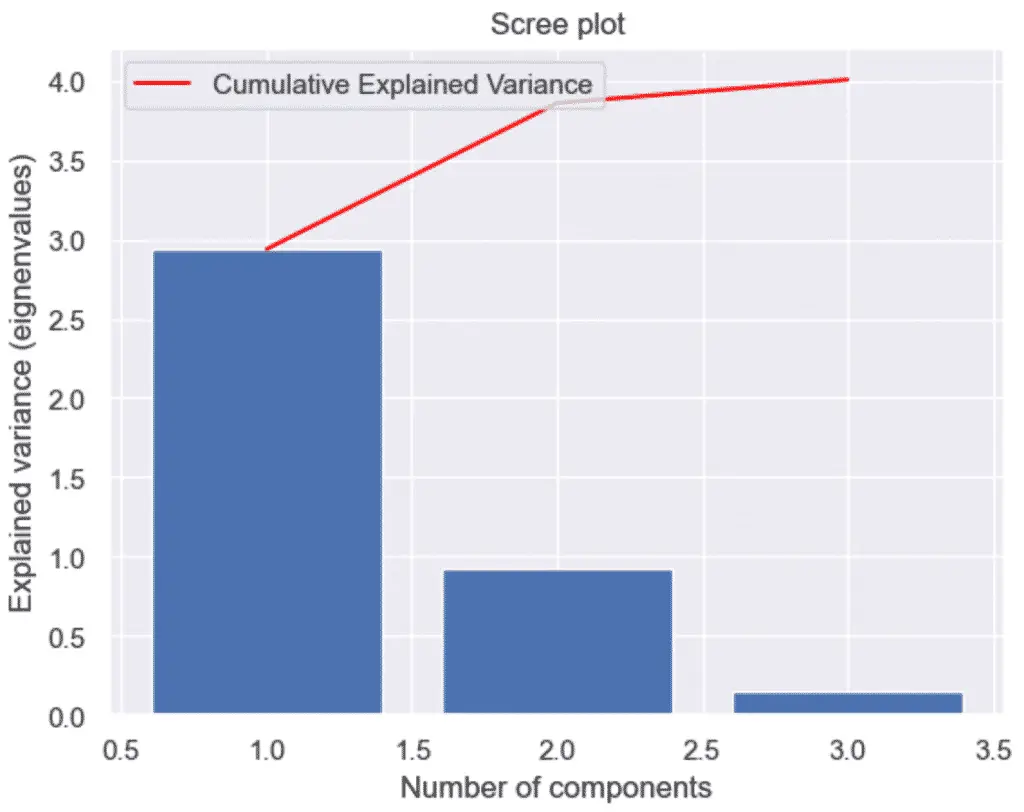
A scree plot, or cumulative explained variance plot, is a graphical representation that combines the feature explained variance plot as well as a line chart showing the cumulative sum of the eigenvalues (or variances) of the principal components in decreasing order.
The scree plot helps to se relative importance of each principal component in capturing the variance in the data. The “elbow” of the plot is often used to determine the number of principal components to retain in an analysis.
Why Make a Scree Plot?
Principal Component Analysis 2D visualizations are only relevant if each principal component capture enough of the original data variance. If not, the visualization will be misleading.
Adding the cumulative sum of the explained variance can help performing elbow tests to identify low variance principal components.
How to Plot a Scree Plot in Python?
To plot the Scree in Python, we need to perform dimensionality reduction on a dataset using the PCA() class of the Scikit-learn library, and then plot the feature explained variance and finally plot the cumulative sum of the variances into the graph.
1. Load the Iris Dataset in Python
To start, we load the Iris dataset in Python, do some preprocessing and use PCA to reduce the dataset to 3 features. To learn what this means, follow our tutorial on PCA with Python.
import pandas as pd
from sklearn import datasets
from sklearn.preprocessing import StandardScaler
from sklearn.decomposition import PCA

# load features and targets separately
iris = datasets.load_iris()
X = iris.data
y = iris.target

# Data Scaling
x_scaled = StandardScaler().fit_transform(X)

# Reduce from 4 to 3 features with PCA
pca = PCA(n_components=3)

# Fit and transform data
pca_features = pca.fit_transform(x_scaled)
From this data, we will learn various ways to plot PCA with Python.
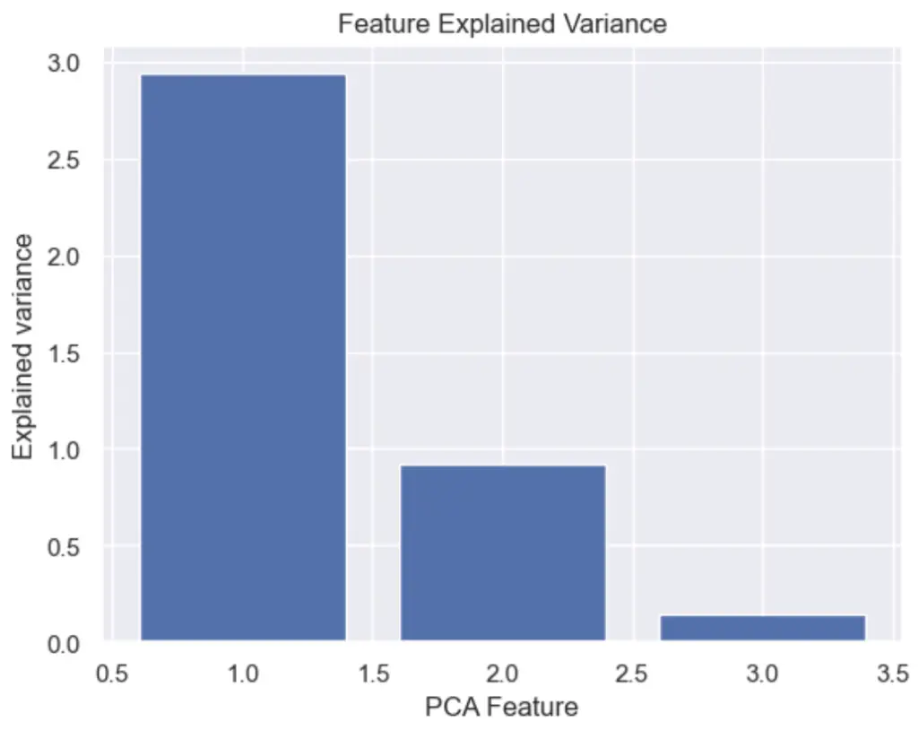
2. Plot the Explained Variance in Python
To plot the explained variance in Python, use matplotlib’s bar chart on the explained_variance_ attribute of the PCA object.
import matplotlib.pyplot as plt
import seaborn as sns
sns.set()

# Bar plot of explained_variance
plt.bar(
    range(1,len(pca.explained_variance_)+1),
    pca.explained_variance_
    )


plt.xlabel('PCA Feature')
plt.ylabel('Explained variance')
plt.title('Feature Explained Variance')
plt.show()
3. Plot the Scree Plot with Python and PCA
To make a scree plot, or cumulative explained variance plot, with Python and PCA, first plot an explained variance bar plot and add a secondary plot of the cumulative sum, also know as the Cumulative Explained Variance.
A scree plot is nothing more than a plot of the eigenvalues (also known as the explained variance). Essentially, it provides the same information as the plot above.
import numpy as np
import matplotlib.pyplot as plt
import seaborn as sns
sns.set()

# Scree Plot
import numpy as np
# Bar plot of explained_variance
plt.bar(
    range(1,len(pca.explained_variance_)+1),
    pca.explained_variance_
    )

plt.plot(
    range(1,len(pca.explained_variance_ )+1),
    np.cumsum(pca.explained_variance_),
    c='red',
    label='Cumulative Explained Variance')

plt.legend(loc='upper left')
plt.xlabel('Number of components')
plt.ylabel('Explained variance (eignenvalues)')
plt.title('Scree plot')

plt.show()
This is it, we have plotted the Scree plot of PCA with Python, Scikit-Learn and Seaborn. Next, we will learn how to Plot a 3D PCA Graph in Python

SEO Strategist at Tripadvisor, ex- Seek (Melbourne, Australia). Specialized in technical SEO. Writer in Python, Information Retrieval, SEO and machine learning. Guest author at SearchEngineJournal, SearchEngineLand and OnCrawl.