As part of the series of tutorials on PCA with Python, we will learn how to plot a feature explained variance plot on the Iris dataset.
The feature explained variance plot is one of the PCA visualization techniques used in dimensionality reduction.
Navigation
Show
What is the Explained Variance in PCA
The explained variance in PCA shows the variance that can be attributed to each of the principal components. It helps us understand how much information is retained after dimensionality reduction. It is the portion of the original data’s variability that is captured by each principal component.
What is the Explained Variance Plot in PCA
The Explained Variance Plot is a visualization that shows the proportion of total variance in the dataset, for each principal component, generally represented as a bar chart in decreasing order.
This plot helps to show how much information each principal component retains from the original data.
Why Use the Explained Variance Plot in PCA?
The feature explained variance plot is used to see the cumulative explained variance for a given number of principal components. This helps to decide on the optimal number of components to keep in Principal Component Analysis (PCA).
How to Plot the Feature Explained Variance in Python?
To plot the feature explained variance in Python, we need to perform dimensionality reduction on a dataset using the PCA() class of the Scikit-learn library, and then plot the explained_variance_ attribute on a bar plot.
Loading the Iris Dataset in Python
To start, we load the Iris dataset in Python, do some preprocessing and use PCA to reduce the dataset to 3 features. To learn what this means, follow our tutorial on PCA with Python.
import pandas as pd
from sklearn import datasets
from sklearn.preprocessing import StandardScaler
from sklearn.decomposition import PCA

# load features and targets separately
iris = datasets.load_iris()
X = iris.data
y = iris.target

# Data Scaling
x_scaled = StandardScaler().fit_transform(X)

# Reduce from 4 to 3 features with PCA
pca = PCA(n_components=3)

# Fit and transform data
pca_features = pca.fit_transform(x_scaled)
From this data, we will learn various ways to plot PCA with Python.
How to Plot the Explained Variance in Python
The explained variance in PCA helps us understand how much information is retained after dimensionality reduction. It is the portion of the original data’s variability that is captured by each principal component.
We can plot the explained variance to see the variance of each principal component feature.
import matplotlib.pyplot as plt
import seaborn as sns
sns.set()
# Bar plot of explained_variance
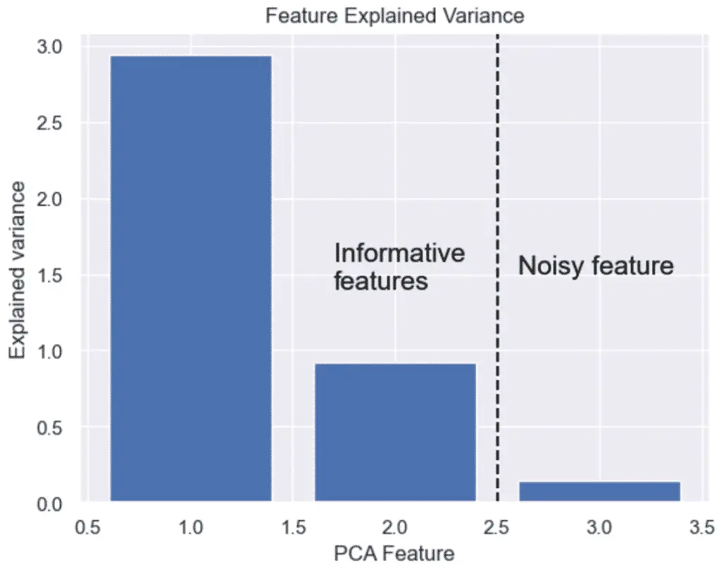
plt.bar(
range(1,len(pca.explained_variance_)+1),
pca.explained_variance_
)
plt.xlabel('PCA Feature')
plt.ylabel('Explained variance')
plt.title('Feature Explained Variance')
plt.show()
The output graph shows that we do not need 3 features, but only 2. The 3 feature’s variance is obviously not very significant.
This is it, we have plotted the feature explained variance of PCA with Python, Scikit-Learn and Seaborn. Next, we will learn how to expand the feature explained variance into a Scree Plot.
Read: How to Make a Scree Plot with Python and PCA

SEO Strategist at Tripadvisor, ex- Seek (Melbourne, Australia). Specialized in technical SEO. Writer in Python, Information Retrieval, SEO and machine learning. Guest author at SearchEngineJournal, SearchEngineLand and OnCrawl.