Data visualization is critical for data analysis. Without it, it is challenging, or sometimes even impossible to share insights on your data. In this tutorial, we will learn the most popular Python libraries for data visualization: Matplotlib, Seaborn, and Plotly.
If is a fundamental part of the data science process. No serious machine learning model was ever built without data visualization.
Most Popular Data Visualization Libraries
Before we dive into creating visualizations, let’s discuss the various libraries we will be using.
Matplotlib
Matplotlib is the most often used library for data visualization in Python. It provides a wide range of plots, including line plots, scatter plots, bar plots, and histograms.
Seaborn
Seaborn is a data visualization library in Python that is built on top of the Matplotlib package. It brings intuitive functions to help solve most problems encountered by other libraries.
Plotly
Plotly is an interactive data visualization library. Not only its visualizations are more beautiful that Matplotlib and Seaborn’s, but you can also interact with them. With Plotly, you can create various plots, such as scatter plots, line plots, bar plots, and more.
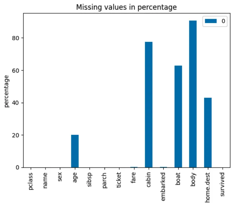
Example of a Matplotlib Visualization in Python
import matplotlib.pyplot as plt
import pandas as pd

from sklearn.datasets import fetch_openml

# load dataset
titanic = fetch_openml('titanic', version=1, as_frame=True)
df = titanic['data']
df['survived'] = titanic['target']

miss_vals = pd.DataFrame(df.isnull().sum() / len(df) * 100)
miss_vals.plot(kind='bar',
    title='Missing values in percentage',
    ylabel='percentage'
    )

plt.show()
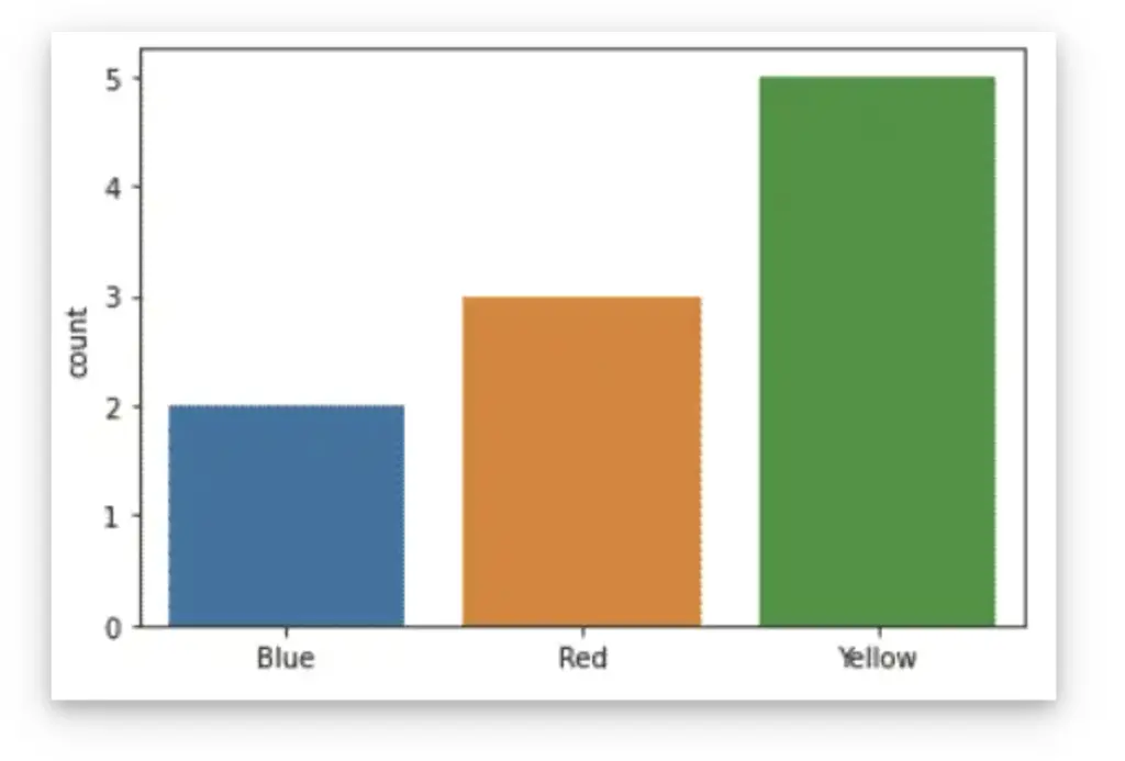
Example of a Seaborn Visualization in Python
In Seaborn you can create visualizations like a countplot.
import seaborn as sns
import matplotlib.pyplot as plt

colors = ['Blue','Blue','Red','Red','Red','Yellow','Yellow','Yellow','Yellow','Yellow']

sns.countplot(x=colors)
plt.show()
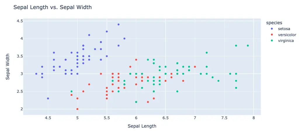
Example of a Plotly Visualization in Python
import plotly.express as px
import pandas as pd

# Load the dataset (in this case, the Iris dataset from seaborn)
iris_df = pd.read_csv('https://raw.githubusercontent.com/mwaskom/seaborn-data/master/iris.csv')

# Create a scatter plot using Plotly Express
fig = px.scatter(iris_df, x='sepal_length', y='sepal_width', color='species')

# Set the title and axis labels
fig.update_layout(title='Sepal Length vs. Sepal Width', xaxis_title='Sepal Length', yaxis_title='Sepal Width')

# Show the plot
fig.show()
Python Articles Using Data Visualization

SEO Strategist at Tripadvisor, ex- Seek (Melbourne, Australia). Specialized in technical SEO. Writer in Python, Information Retrieval, SEO and machine learning. Guest author at SearchEngineJournal, SearchEngineLand and OnCrawl.