As part of the series of tutorials on PCA with Python, we will learn how to plot a 2D PCA graph (scatter plot) on the Iris Dataset with Python, Scikit-learn and Matplotlib.
Navigation
Show
What is 2D PCA Scatter plot?
A 2D PCA (Principal Component Analysis) scatter plot is a PCA visualization that shows the distribution of data points in a two dimensional space after reducing a dataset to 2 PCA features.
How to Plot a 2D PCA Graph in Python?
To plot a 2D PCA scatter plot in Python, reduce the number of features to 2 principal components. After, use matplotlib to generate a two-dimensional scatterplot from the data.
Here are the detailed steps to plot a 2D PCA scatter plot in Python:
- Load the required Python Libraries
- Load your Dataset
- Scale and Reduce the Number of Features Using PCA
- Prepare the PCA DataFrame
- Plot the 2D Scatterplot with Seaborn’s lmplot
1. Loading the Required Python Libraries
import matplotlib.pyplot as plt
import pandas as pd
import seaborn as sns
from sklearn import datasets
from sklearn.preprocessing import StandardScaler
from sklearn.decomposition import PCA
sns.set()
2. Loading the Iris Dataset in Python
To start, we load the Iris dataset in Python, do some preprocessing and use PCA to reduce the dataset to 3 features. To learn what this means, follow our tutorial on PCA with Python.
# load features and targets separately
iris = datasets.load_iris()
X = iris.data
y = iris.target
From this data, we will learn various ways to plot the 3D PCA graph with Python.
3. Scale and Reduce the Number of Features Using PCA
Next, scale the date before applying PCA, and select the n_component to be equal to 2.
# Data Scaling
x_scaled = StandardScaler().fit_transform(X)

# Reduce from 4 to 2 features with PCA
pca = PCA(n_components=2)

# Fit and transform data
pca_features = pca.fit_transform(x_scaled)
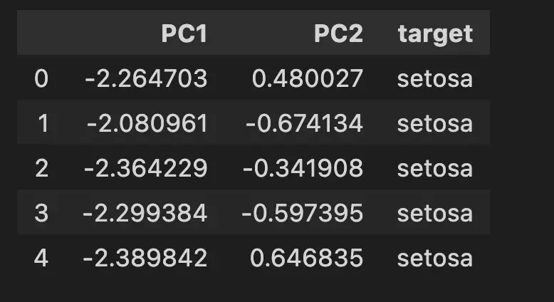
4. Prepare the PCA DataFrame
Next, we will create a PCA dataframe, using the principal component features and map the names to the target variables for better legibility.
# Create dataframe
pca_df = pd.DataFrame(
    data=pca_features,
    columns=['PC1', 'PC2'])

# map target names to PCA features
target_names = {
    0:'setosa',
    1:'versicolor',
    2:'virginica'
}

pca_df['target'] = y
pca_df['target'] = pca_df['target'].map(target_names)

pca_df.head()
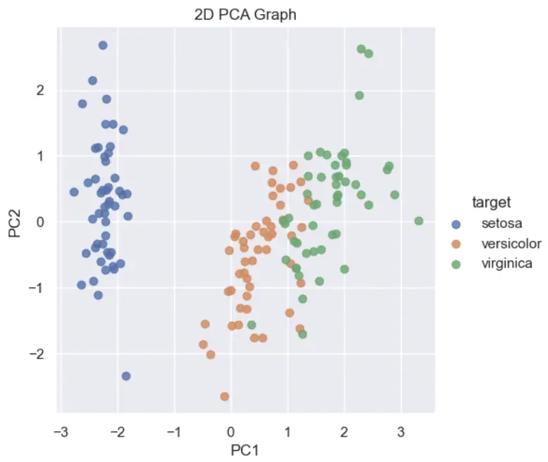
5. Plot the 2D Scatterplot with Seaborn’s lmplot
Finally, use seaborn’s lmplot function to plot the PCA dataframe into a two-dimensional scatter plot.
sns.lmplot(
    x='PC1',
    y='PC2',
    data=pca_df,
    hue='target',
    fit_reg=False,
    legend=True
    )

plt.title('2D PCA Graph')
plt.show()
Next Steps
After plotting a 2D PCA Scatterplot, it is interesting to learn how to plot a 3D PCA Scatterplot and how to plot a 2D PCA Biplot.
Full Code
import matplotlib.pyplot as plt
import pandas as pd
import seaborn as sns
from sklearn import datasets
from sklearn.preprocessing import StandardScaler
from sklearn.decomposition import PCA
sns.set()

# load features and targets separately
iris = datasets.load_iris()
X = iris.data
y = iris.target

# Data Scaling
x_scaled = StandardScaler().fit_transform(X)

# Reduce from 4 to 2 features with PCA
pca = PCA(n_components=2)

# Fit and transform data
pca_features = pca.fit_transform(x_scaled)

# Create dataframe
pca_df = pd.DataFrame(
    data=pca_features,
    columns=['PC1', 'PC2'])

# map target names to PCA features
target_names = {
    0:'setosa',
    1:'versicolor',
    2:'virginica'
}

pca_df['target'] = y
pca_df['target'] = pca_df['target'].map(target_names)

# Plot the 2D PCA Scatterplot
sns.lmplot(
    x='PC1',
    y='PC2',
    data=pca_df,
    hue='target',
    fit_reg=False,
    legend=True
    )

plt.title('2D PCA Graph')
plt.show()

SEO Strategist at Tripadvisor, ex- Seek (Melbourne, Australia). Specialized in technical SEO. Writer in Python, Information Retrieval, SEO and machine learning. Guest author at SearchEngineJournal, SearchEngineLand and OnCrawl.