Search engine optimization (SEO) is critical for any website hoping to rank well in search engine results pages (SERPs). One way to improve your SEO is to use machine learning techniques to analyze data and identify the best keywords and strategies to help you rank higher on Google.
On an episode of Google Search Training, Daniel Waisberg shows how to use bubble charts to analyze Search performance data with Looker.
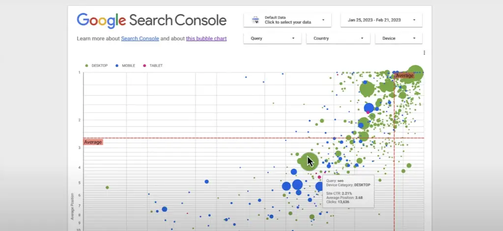
Bubble charts are one of the most effective ways to gain insights into multiple metrics and dimensions simultaneously.
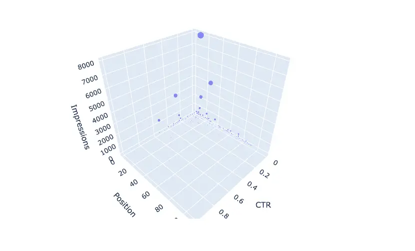
In this tutorial, we are going to show you how to build your own 3D bubble chart from Google Search Console Data with Python and Plotly Express.
They help to identify patterns and correlations in your data, and to optimize your queries. In this video, you’ll learn how to interpret clicks, click-through rate, and average position for different devices and queries, using Search Console to improve your website’s performance.
Whether you’re a beginner or an expert, this video is a must-watch for anyone interested in optimizing their website’s SEO.
Fortunately, Python has robust libraries like pandas, scikit-learn, and plotly.express that make it easy to create machine learning models and visualize data.
In this post, we’ll show you how to use these tools to create an SEO script that can help you optimize your site and improve your SERP rankings.
Python Script to Create Bubble Chart from GSC Data
The code below demonstrates how to use various Python libraries such as pandas, scikit-learn, and plotly.express to create a machine learning model, make predictions, and visualize the data.
import pandas as pd
import plotly.express as px
from sklearn.linear_model import LinearRegression
from sklearn.ensemble import RandomForestRegressor
from sklearn.neural_network import MLPRegressor
# Read data from CSV file
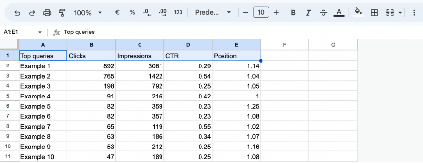
df = pd.read_csv("random-Queries.csv")
# Select the regression model (change the value of 'model_type' to use a different model)
model_type = 'neural_network'
if model_type == 'linear_regression':
model = LinearRegression()
elif model_type == 'random_forest':
model = RandomForestRegressor(n_estimators=100)
elif model_type == 'neural_network':
model = MLPRegressor(hidden_layer_sizes=(10,), activation='relu', solver='adam')
# Create a linear regression model using Clicks, CTR, Average Position, and Impressions to predict bubble potential
X = df[['CTR', 'Position', 'Impressions']]
y = df['Clicks']
model.fit(X, y)
# Make predictions on Clicks using the newly created model
df['prediction_Clicks'] = model.predict(X)
# Sort the bubbles based on predicted Clicks to identify those with the highest potential
df = df.sort_values(by=['prediction_Clicks'], ascending=True)
# Export the data to a new CSV file
df.to_csv('new_file.csv', index=False)
# Set negative values of the 'predicted_Clicks' object to zero (uncomment if the error occurs)
df.loc[df['prediction_Clicks'] < 0, 'prediction_Clicks'] = 0
# Create a 3D scatter plot with Plotly showing the Clicks predicted by the model
fig = px.scatter_3d(df, x="CTR", y="Position", z="Impressions", size="prediction_Clicks", hover_name="Top queries")
# Add the regression line to the plot
x_fit = [min(df['CTR']), max(df['CTR'])]
y_fit = [min(df['Position']), max(df['Position'])]
z_fit = [min(df['Impressions']), max(df['Impressions'])]
xyz_fit = pd.DataFrame({'CTR': x_fit, 'Position': y_fit, 'Impressions': z_fit})
df['prediction_Clicks'] = model.predict(X)
fig.add_trace(px.line_3d(xyz_fit, x=x_fit, y=y_fit, z=z_fit).data[0])
# Show the interactive plot
fig.show()
Instructions for use
- Export the CSV with the queries to be analyzed from Google Search Console, or alternatively extract using Google Search Console API.
- In the CSV, change the “CTR” column from % format to “number” format.
- Import the file into Google Colab in this notebook.
- Change the string with the name of the file to csv.
- Choose one of the three Machine Learning models and insert it in model_type.
- Run the script.
- The script creates a new CSV with an additional column given by the predicted values compared to the original file.
Example CSV file
Machine Learning Models Used
- Linear Regression: it is an analysis technique used to analyze the relationship between two or more variables. It is not always possible to graphically represent the relationship between variables, but if the variables are numeric, it is possible to plot a scatter plot to visualize the relationship.
- Random Forest: a random forest is a collection of independent decision trees. The results of individual trees are combined to produce a final prediction.
- Neural Networks: neural networks are a highly complex machine learning model inspired by the functioning of the human brain. Neural networks are used for classification, regression, and many other machine learning activities.
How it works
The script uses a neural network regression model to predict bubble potential based on clicks, CTR, average position, and impressions. It then sorts the data to identify the queries with the highest potential and exports it to a CSV file.
Here’s a brief description of what the code does:
- First, pandas is used to read in data from a CSV file containing random queries.
- Next, a regression model is selected by setting the value of model_type. This can be changed to use a different model, such as linear regression or random forest.
- The MLPRegressor model is then trained on the data using the features CTR, Position, and Impressions to predict bubble potential based on Clicks.
- Predictions for Clicks are made using the trained model and sorted in ascending order to identify the queries with the highest potential.
- The data is exported to a new CSV file using pandas.
- Negative values in the ‘predicted_Clicks’ object are set to zero (uncomment if the error occurs), to avoid negative predictions.
- Finally, Plotly is used to create an interactive 3D scatter plot showing the predicted number of clicks for each query based on the model’s predictions. A regression line is also added to the plot.
Overall, this code demonstrates the power and flexibility of Python and its various libraries for data analysis and machine learning. By using Python in conjunction with these libraries, it’s possible to quickly and efficiently develop solutions to complex problems, and visualize the results in a meaningful and interactive way.
Interactive 3D scatter plot with Plotly
But that’s not all! The script also generates an interactive 3D scatter plot with Plotly, showing the predicted number of clicks for each query based on the model’s predictions. A regression line is also added to the plot, making it easy to visualize your predicted rankings.
By using this script, you can identify the best keywords to target for your website and create content that is optimized for those keywords. This can help you rank higher in SERPs and ultimately drive more traffic to your site.
In Summary
In conclusion, using machine learning and Python libraries like pandas, scikit-learn, and plotly.express can be a powerful tool for improving your SEO. By creating a regression model and visualizing your data with plotly, you can identify the best keywords and strategies to optimize your site for a higher ranking in SERPs. Give it a try today and see how much more traffic you can drive to your site!

SEO Specialist for luxury hospitality, I love research and analysis as much as a good scotch whisky, playing chess and living with music.