Data studio and Search Console are valuable tools to identify low hanging fruits optimisations. We’ll show multiple reports that you can use to find quick wins for SEO.
Why go for low-hanging fruits?
The answer is simple: they are comparatively easier to perform and can give fruitful results to the business in relatively less time.
I have created a low-hanging fruit Google Data Studio dashboard using Google Search Console data. I’ll take you through what it consists of and how to make use of it.
Okay, now let’s march towards our objective of this article and understand the process of plucking low-hanging fruits in the data realm.
Here are the topics we would cover in this article:
Navigation
Show
Disclaimer: The data shown in the images are arbitrary with no resemblance with any site. Any resemblance is just a matter of coincidence.
Quick overview of Google Search Console (GSC) & Google Data Studio (GDS).
Are you new to Google Search Console and Google Data Studio and have stumbled upon this article? Do not panic. Take a deep breath, drink a glass of water, and read the below articles to have a better understanding of the two tools you just heard about.
Here is a quick overview of:
- Google Search Console: It is a Google’s tool that shows you a Google’s mirror of your website and tells how Google/Googlebot sees your website. The tool gives you vital pieces of information about keywords, landing pages, their clicks, impressions, CTR, average position, mobile-friendliness, statuses of crawls, and indexing with various slices, sitemaps, schema markup, and many many more!
- Google Data Studio: It is a Data Visualization tool. You can connect Google Data Studio to various sources like Google Search Console, Google Ads, BigQuery, CSV, Google Analytics, Google Sheets, and many more. As we write this article there are 440 connectors available to connect with Google Data Studio. You may connect to any of the connectors relevant to your business and start creating visualizations. You can also blend various data sources to create a single view but that depends upon the viability of the connectors.
How to connect GSC with GDS?
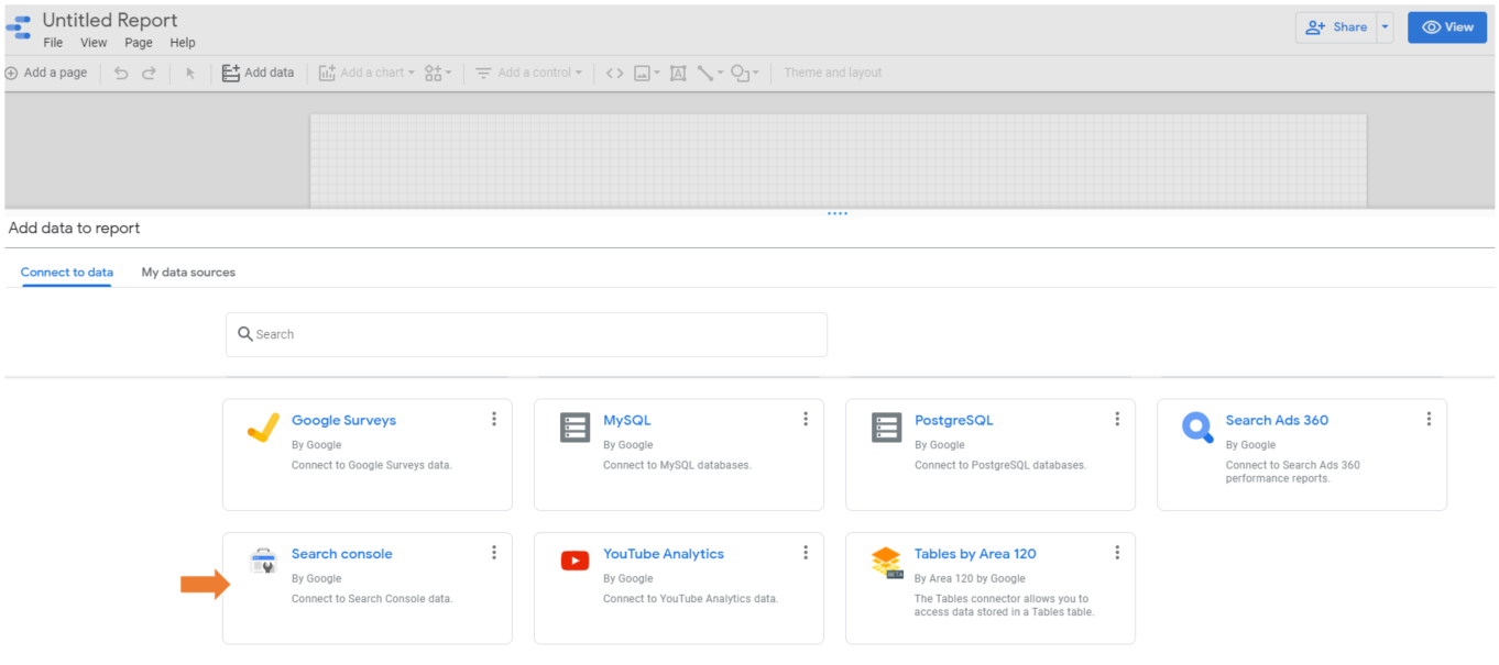
Go to Datastudio and create a report. Add your data source by selecting the Google Search Console connector. Choose from the list of available properties and select a method of aggregation.
- Site Impression: Aggregates data for the entire property.
- URL Impression: Aggregates data by page. The result is sampled more heavily.
For detailed steps read the article: How to connect Google Search Console with Google Data Studio
Data Studio Reports for low-hanging fruit identification
In our dashboard, we would be using both Site Impression and URL Impression to get answers to our questions. At a broad level, when we are looking for data that involves site pages, e.g. pages performance, queries broken down by pages, or vice versa, we would go for URL Impression data. And when we want just query level data we can opt for Site Impression data.
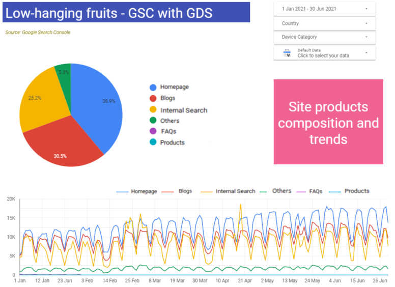
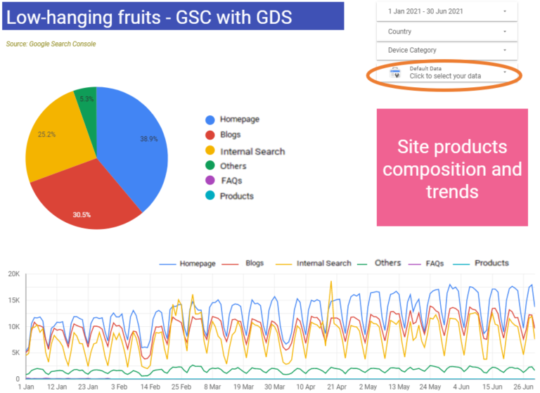
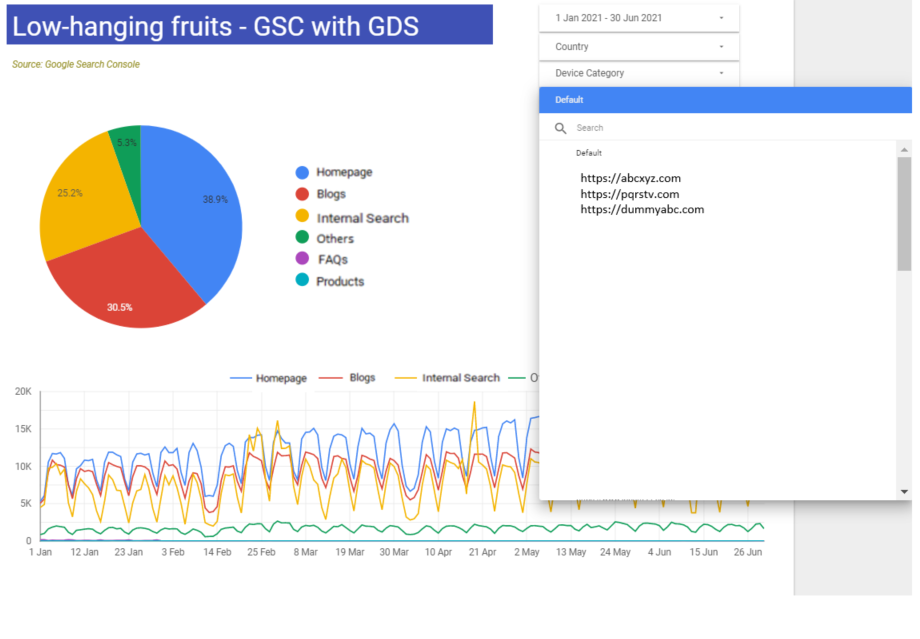
What is the composition of various site products?
Now, how can you play around here and what can you infer?
You can play with the date filters. I have selected the first 6 months of the year 2021, then you can also choose from the country drop-down, also select device from the device category drop down and lastly choose any other site for which you have access and follow a similar pattern in terms of URLs.
From the inference point of view, looking at the image above, we can understand 39% of clicks were generated by the Homepage itself, and more than the Products (25%), Blogs (31%) are generating clicks to the overall website. Now depending upon the situation, you may want Products to generate more clicks and you see an opportunity by looking at the bottom time-trended chart which tells there were times when Products had outshined other site products but not regularly. The question could be what were those factors, and how you can make it sustainable.
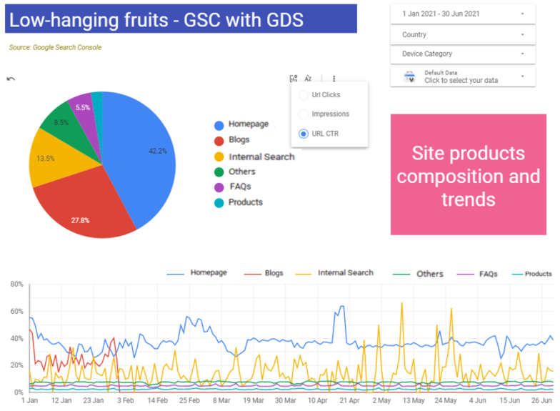
When you hover the mouse over these charts, you will see three small icons around them. The first icon is Optional metrics where you can toggle between impressions, clicks, and CTR. When clicked on CTR, it gives me another view of looking at data and makes it interesting to understand the trends.
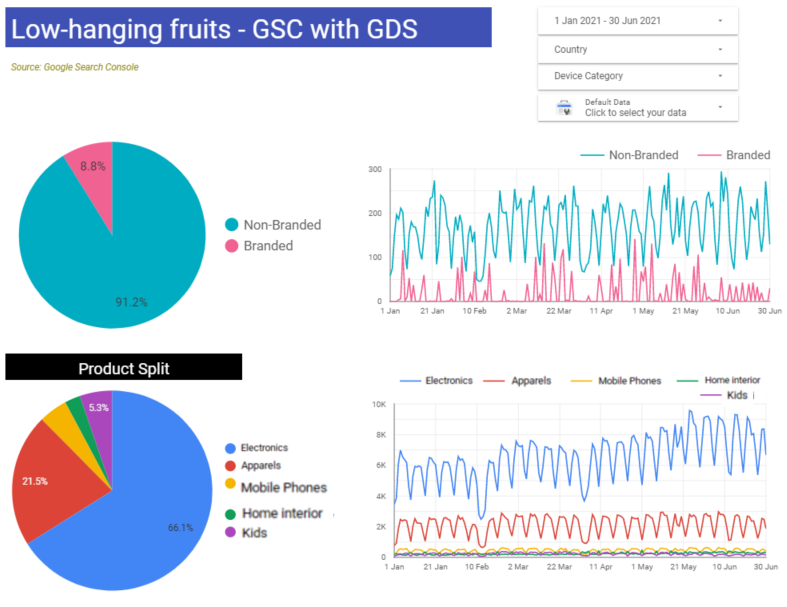
What is the composition of branded vs non-branded keywords?
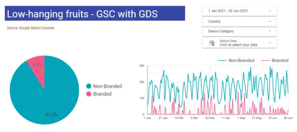
This view helps us to understand how users are reaching our website? Are they using branded terms or non-branded terms and what is their split? Looking at the above image we can understand overall 91% of queries were non-brand. And the time-trended chart can tell us the spread of that 91% i.e. did it happen because of any one-month data skewness or was it consistent across all the days?
How are various site products or certain pages performing? (Bonus tip included)
Similar to the pie chart which splits non-branded and branded queries, we can create pie charts slicing only Product pages and analyze how they are performing against each metric?
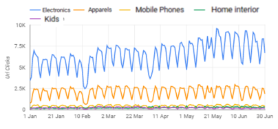
Looking at the below image, we can understand Electronics-based Products have generated most of the clicks i.e. 66%. The time series trend chart shows how strongly Electronics is going ahead, followed by the Apparels.
These charts can help us immensely to answer various questions/scenarios. For instance, in this year 2021, I had majorly focussed on Kids based products (based on a huge search demand) and introduced 5x product items vs. Apparels, yet the Kids category was far behind Apparels, Mobile Phones, and Home Interior in terms of generating clicks. Makes me think and analyze whether it is happening because of any noindex issue, canonicalization issue, cannibalization issue, or any other issue which is hindering Kids product pages to create more traffic than the rest of the site products?
Bonus tip
The below views may help you to strategize your anchor texts, internal linking and link building.
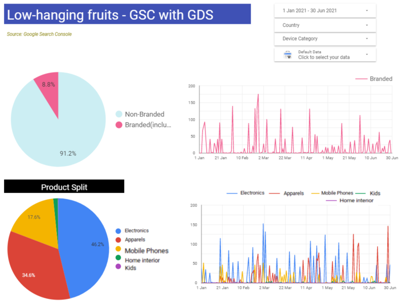
When you click the “Branded” pie in the first pie chart on the page, all the charts will automatically reflect the data with respect to the branded queries. Therefore, the Product Split pie chart now will show the pies based on the branded keyword traffic.
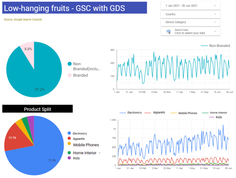
Similarly, when you click “Non-branded” pie in the first pie chart on the page, all the charts will automatically reflect the data with respect to the non-branded queries.
These views can help us to analyze which are those products where we have made a user connection and the users are searching the products along with our brand name. This, along with search volume data analysis, can help us to understand our dominance over those products and similarly, can show where the opportunities lie for growth.
When you select “Branded” in the first pie chart.
When you select “Non-Branded” in the first pie chart.
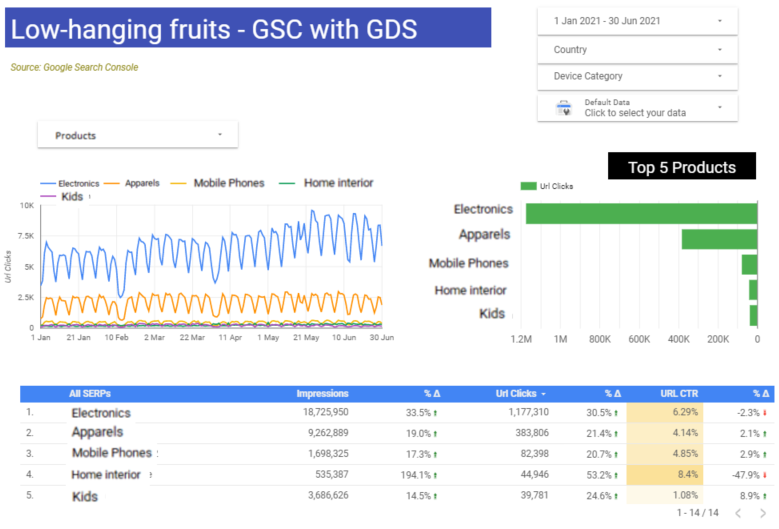
We can also consume these data in tabular form and compare them with YoY or previous time periods.
You can also notice in the time trended chart, there are predominantly two products: Electronics and Apparels because of which we are unable to see a clear time trended view of other products as those are squeezed up. Therefore, in order to see them clearly, you can make use of the Products drop-down filter and select one or many products based on your wish.
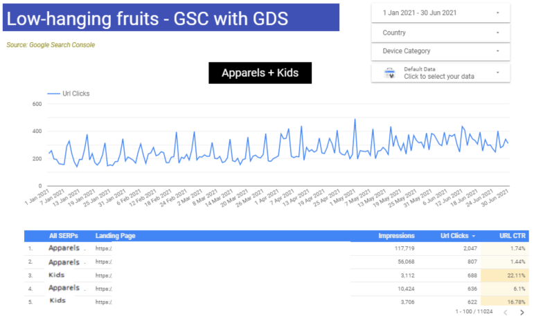
Can we create a single line chart for the cumulative effect of certain site products?
The answer is, yes of course we can.
So, in our scenario, if we want to club Apparels and Kids into one category for the purpose of analysis, we can do that. In the previous images, you have seen these charts where each individual product had its own trended line.
Now, we will create one single-time-trended line that will give a cumulative metric view of Apparels + Kids product categories.
How to identify if there are non-business / low quality / non-whitelisted pages picking or spiking clicks/impressions?
As we have made several slices of site products, we have also made a slice of “Others” which consist of About us, Contact us, privacy policy and other miscellaneous pages which do not fall in the other site products.
Going back to image 1 which can help us to make two important observations from the “Others” site section.
- If clicks/impressions for “Others” show any spikes, then we can further dig down which pages are showing up more in Google SERPs or are generating traffic. In a scenario where the contact us and about us kind of pages show any spikes, we can consider no anomaly as these are the regular website pages.
- But if we see a surge in clicks/impressions due to non-regular pages, we need to check if it’s happening because of any weird/non-desirable (staging) URLs being indexed, or any spamming or any parameterized URLs being indexed, etc.
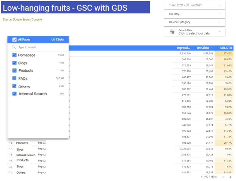
The below view can help us to download CSV or Excel format of all the website pages by site products. Alternatively, we can also use the dropdown and just select “Others” and download the CSV/Excel. We can then further analyze which pages are creating the spikes in “Others”. If you don’t want to download a CSV/Excel, then you can analyze them in the Data Studio view itself. We can download up to 1M rows of data in a single click.
A one-stop dashboard for all the sites sharing the same patterns.
By now, you would have seen we are placing a “Data control” filter on all the pages i.e. a drop-down filter to choose a GSC property. Since, we have created all the visualizations using case statements, therefore this dashboard would be ideal if you have any other website with similar URL patterns. And toggling just within Data control filter to choose a GSC property of your choice will ready the whole dashboard for that property within minutes.
Expanding the Data control drop-down will expose all the GSC site properties you have access to.
How to create site products slices, page-specific slices, and branded vs. non-branded visualizations?
To create these custom slices of your website and segregate them as site products you need the following ingredients:
- Custom dimension
- Regex
- Case statements
Click on the “Edit” dashboard, then Go to the data source and click on the pencil icon to edit it.
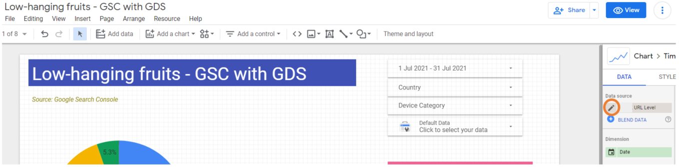
Alternatively, you can reach Data Source from “Resource” in the options tray at the top.
Steps to put all the ingredients into the mix to create a custom site product view:
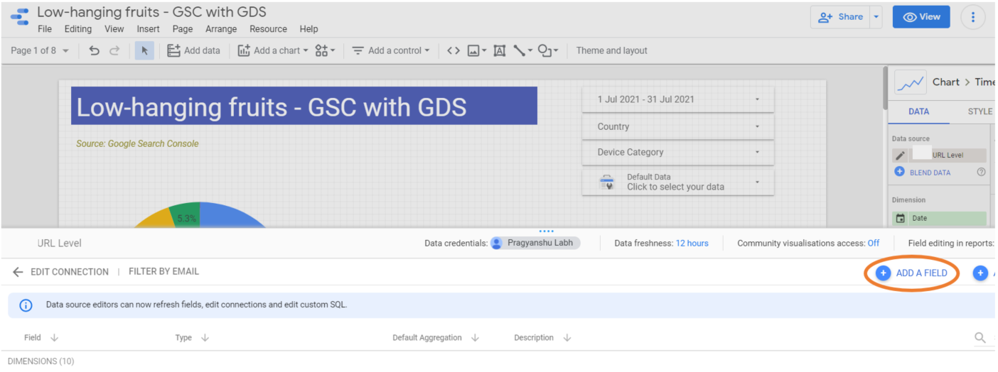
- Click on “ADD A FIELD”
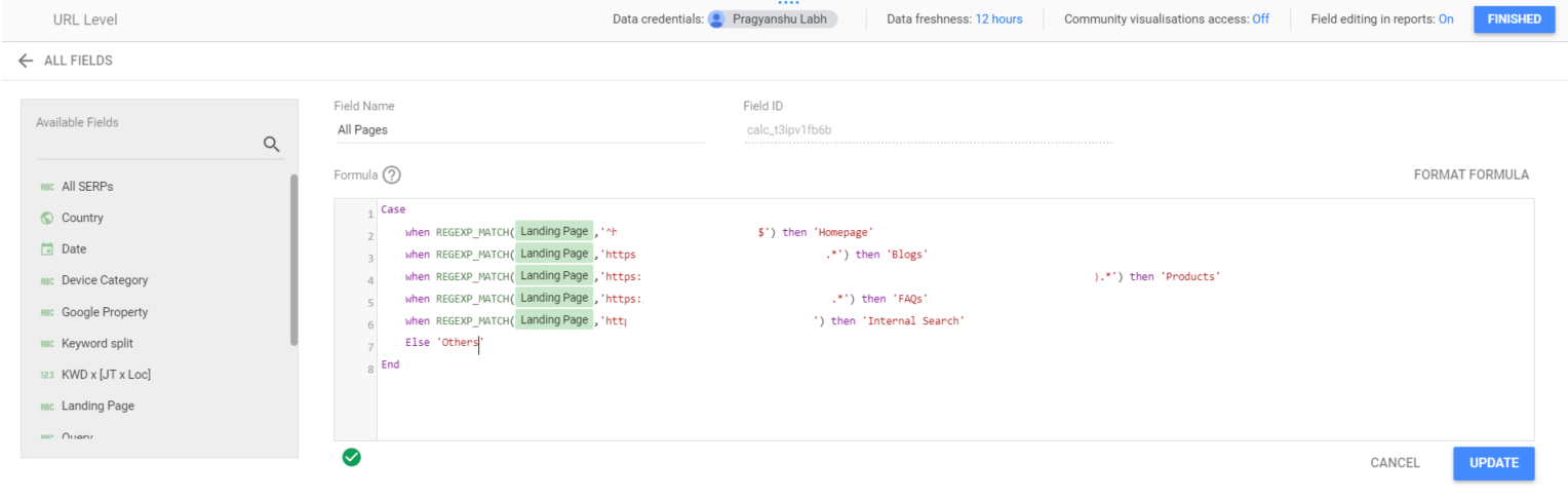
- It will open a new prompt to create a custom dimension. This is the place where you have to write your case statement based on regex and create website slices by product.
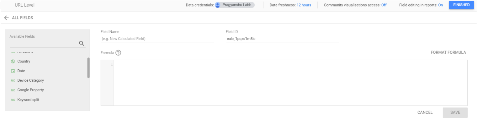
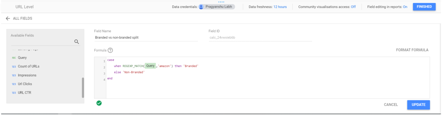
- Let’s create a custom dimension for branded and non-branded keywords. Write a case statement. Let’s say the brand term is “amazon”. Then this is how you would write a case statement for branded vs non-branded split.
- Name the “Field Name” based on your choice, click “Update” and then click “Finished”.
- Similarly, you can create a custom dimension for all the website site products.
Here is a great resource of regex help by JC, the SEO guru!
- Go ahead and make a custom dimension for your various products.
- Now, all you need is to drag and drop these custom dimensions in the data studio to create any visualization. Ready to fly high!
Limitations and challenges
- Erroneous data: If you want to break keywords by landing pages by average position using the GSC native connector, then it becomes erroneous most of the time. To achieve this view, firstly you need to blend data i.e. combine two data sources which are Site Impression and URL Impression. As we know the URL Impression doesn’t have an average position, therefore we need blending of data sources but the resultant is incorrect.
- Latency: Latency could be a challenge but not a significant driver. Connecting GSC API with BigQuery and then to GDS can help you to run reports faster and may save you a couple of minutes at max.
- Number of rows: Using native GSC connector you can only populate up to 1M rows of data in a table. Using GSC API, you would be able to fetch more than 1M rows.
Conclusion
We are now done with our walkthrough. I have also created some additional views (broken down by day etc.) of data in this dashboard. Let me know by commenting on LinkedIn or Twitter or here, if you are interested to get the readymade template for immediate use? I’ll create a template shortly then.
The same dataset can be seen through various lenses. You can always be creative around slicing and dicing the data based on the business questions and create more powerful dashboards. Thanks for reading through. Reach out for any questions 🙂

Currently, SEO Specialist at SEEK Asia. An SEO and Digital Analytics enthusiast. More than 10 years of experience across various industries and geographies. Always a learner and seeking to contribute.